I like how well the post processing on this picture turned out. The colors really come out well without looking too unnatural. The contrast is more unnatural, but that is so common now a days that it shouldn’t turn most people off.
Some might say I overdid things with this picture, but if I did, I sure had a lot of fun doing it. To me photography is not just about capturing a scene, it’s about creating art.
I love the way the picture draws your eyes to the magnificent clouds on the top. This is from the vibrant colors and brighter on the top vs the duller colors and values on the bottom. The blue and orange colors create a nice color theme.
When you take a picture think of how it will look when your done editing. Originally the clouds in this picture were a muddled blue-gray, and the mountains and houses were dark and difficult to make out.
This picture was taken early in the morning as soon as night started lifting and the sky brightened a bit. There was still over an hour or so until the sun would come up, and it would be what photographers like to call the golden hour. I sort of like taking pictures at this time of day better than the golden hour, but I think that might just be because I like the feeling of being up and taking pictures in the mountains early in the morning. The only source of light in this picture was the moon.
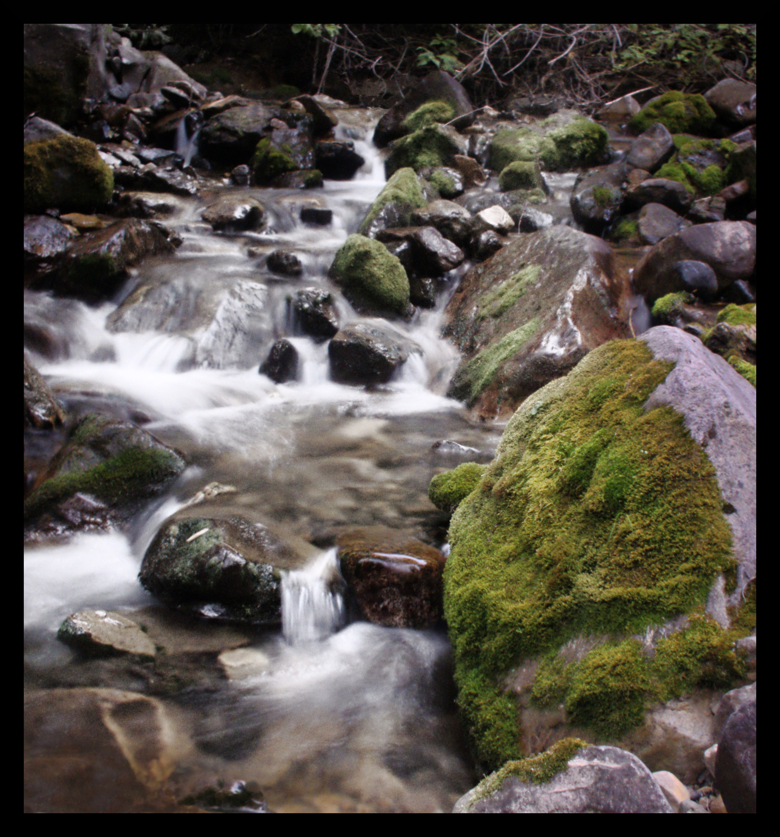
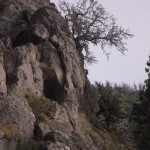
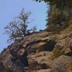
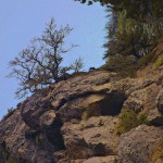
original version
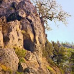
removed some branches
darkened shadows
darken the highlights
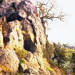
darkened a big area in the top right and a smaller area in the top left and bottom right corners and the right side of the big rock.
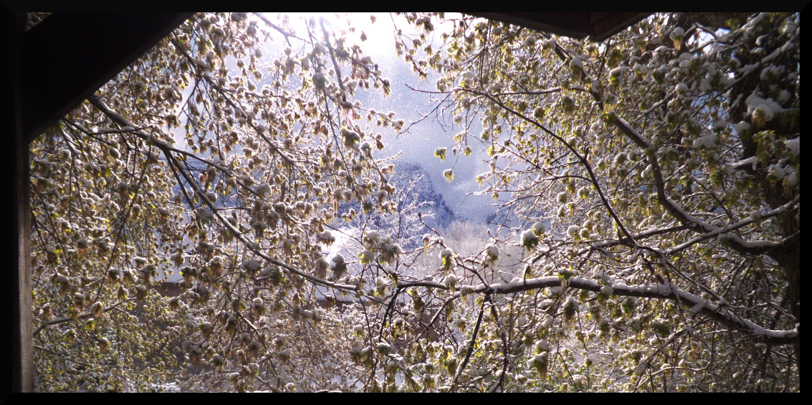
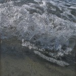
When this late snowfall arrived last year, I grabbed my camera and started snapping pictures. The combination of snow and blooming, green plants is amazing. The snow that’s falling down is actually coming from melting snow from the overhead trees. It was weird, all of a sudden the sun came out from behind the clouds, and big clumps of snow started falling everywhere. I took cover, and started shooting like mad.
April Snowfall
original version
1. I started by adding contrast to the sky, mountains, and the grass around the trampoline.
2. Here I’ve added more contrast to various parts of the image. I must have done something tricky with the way the contrast was added because the highlights are affected the most in the mountains, but down by the trampoline the shadows are affected the most.
3. I was messing around with the gradient map tool to get this. A similar image could be made with the curves tool. I overlayed this image with the previous image to get the image in picture #4
4. This is the resulting image after overlaying picture #3 with picture #2
After doing a bunch of other preliminary tweaks, I used the above series of steps on the featured image and loved the results. In trying to replicate these results in other images, I found a few helpful tips that I’ve listed below.
When applying this affect keep in mind:
The old photo affect adds these annoying black splotches and changes the image to a sepia image. To fix this use GMIC’s custom code (global) filter instead of the old photo filter and type in -noise 20 -bilateral 30,60 -blur 2 -sharpen 100 -n 0,255 you can tack on a -sepia to that if you want to get the sepia affect.
Before applying the c2g filter, experiment with adding masks to the old photo layer. Splotchy looking masks created with paint brushes that have a big spread work well.
These filters take awhile to process. Especially the c2g filter, which can take hours to process if you push the sliders to far. You’ll also end up with a normal black and white picture, so your not going to want to push the c2g sliders too far. At the same time, the c2g filter often looks better when the sliders are pushed up a little.
original version
The photo after the old photo look was applied
Afterwards I went back to the old photo pic and did some additional processing to get this image.
alternate processing of the image to bring out the colors.
final version
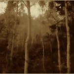
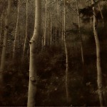
My original attempt at trying to replicate the look of the pic of the aspen trees. Completely terrible.
Eventually I figured out how to replicate the look I wanted.
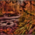
I love the way this image almost looks natural when it’s flipped on it’s side. You can see a version of the picture flipped upright here. That same link also describes some of the techniques I used to manipulate the color in the image.
This used to be the final version of the image.
this one is the original
I tried increasing the size of the highlights giving it a magical feel
 I like how well the post processing on this picture turned out. The colors really come out well without looking too unnatural. The contrast is more unnatural, but that is so common now a days that it shouldn’t turn most people off.