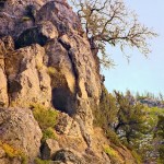
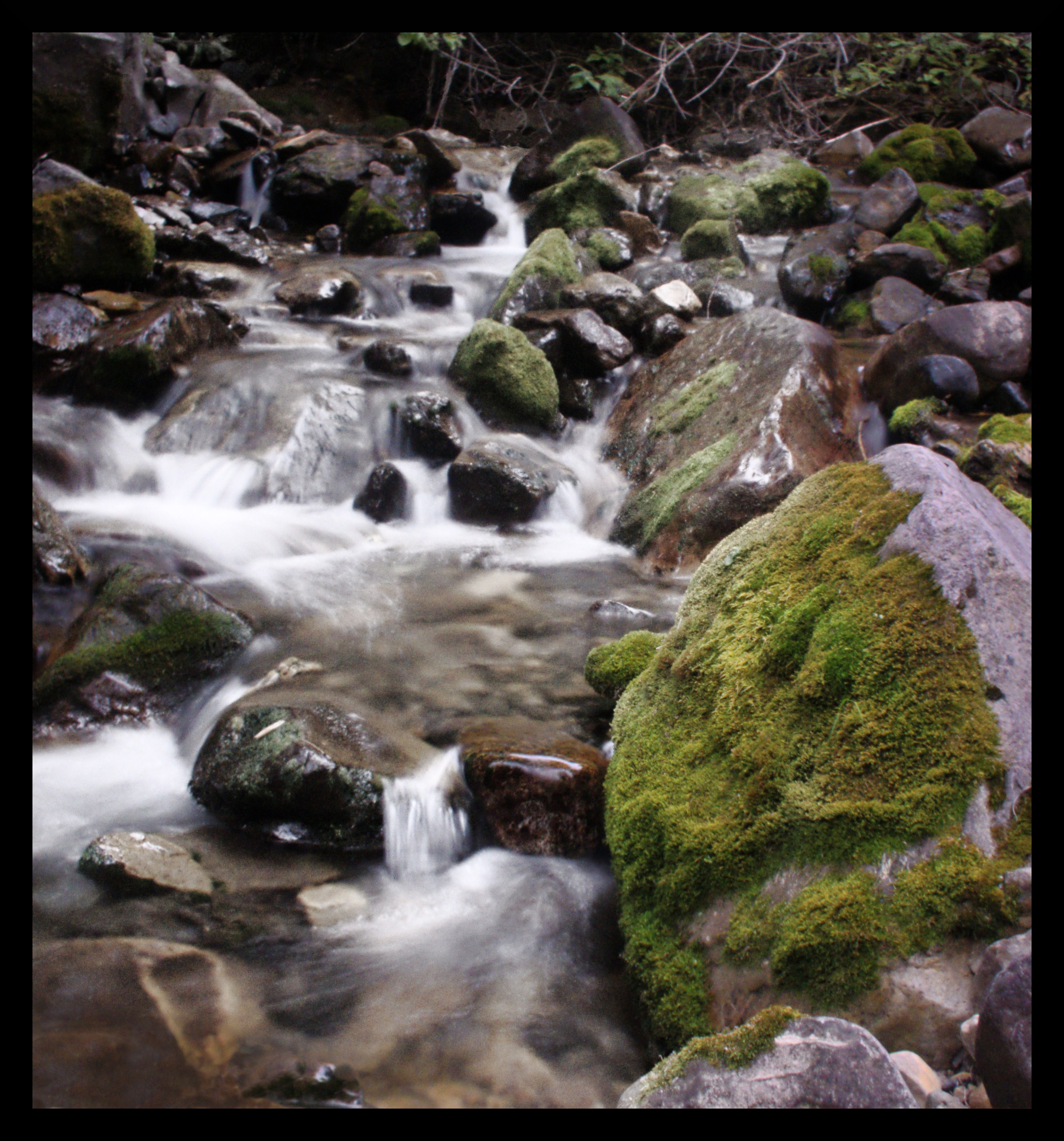
I used rawtherapee to process this picture.
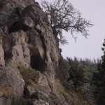


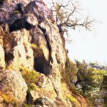
 I used rawtherapee to process this picture.
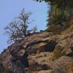


screaming it out


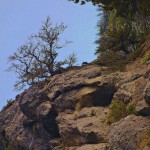
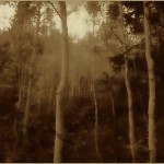
 This picture was taken early in the morning as soon as night started lifting and the sky brightened a bit. There was still over an hour or so until the sun would come up, and it would be what photographers like to call the golden hour. I sort of like taking pictures at this time of day better than the golden hour, but I think that might just be because I like the feeling of being up and taking pictures in the mountains early in the morning. The only source of light in this picture was the moon.


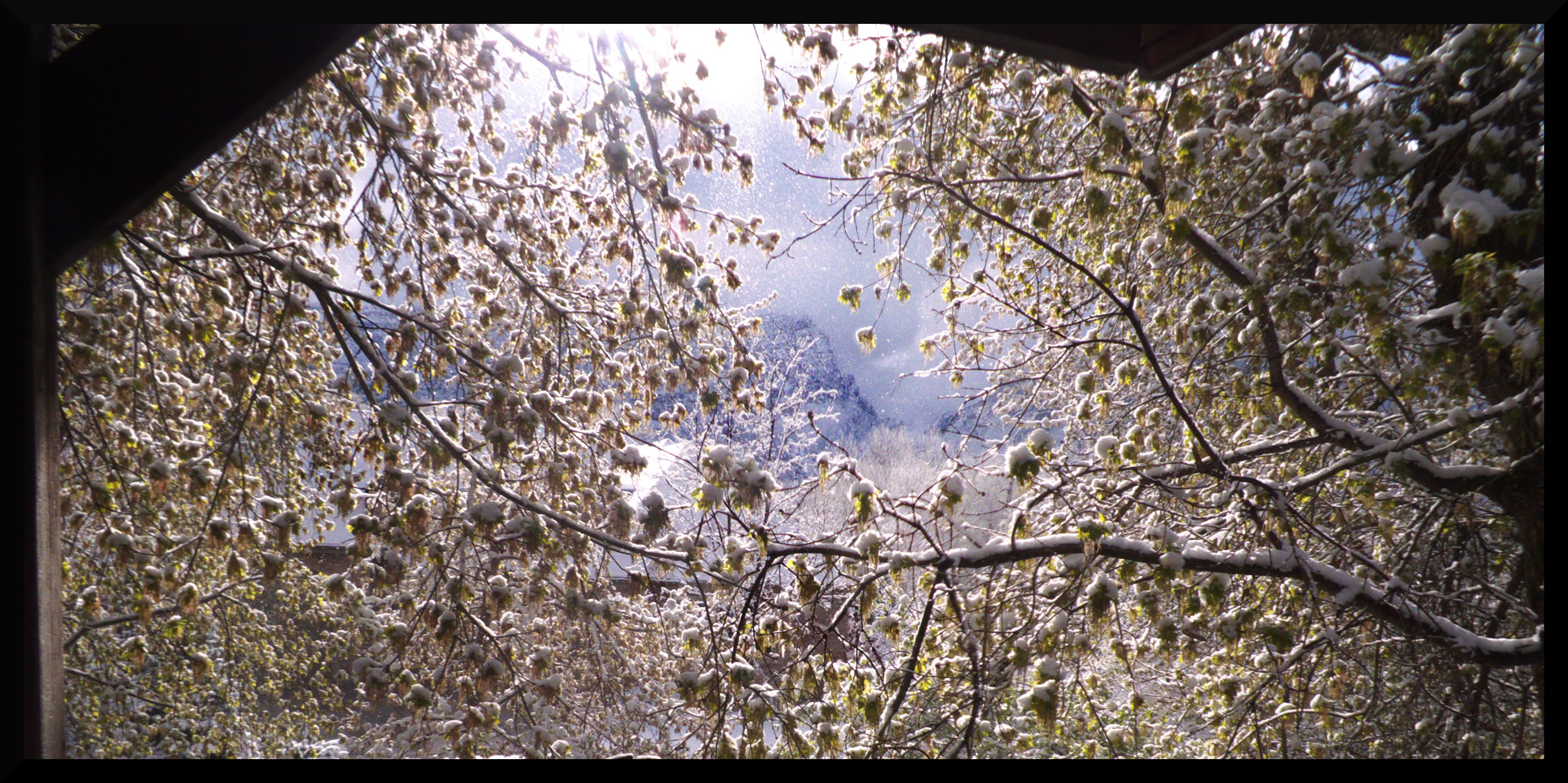

April Snowfall


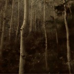
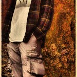
 This picture was a revolutionary picture for me. I discovered an interesting style for creating pictures. It works like this.
-noise 20 -bilateral 30,60 -blur 2 -sharpen 100 -n 0,255 you can tack on a -sepia to that if you want to get the sepia affect.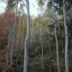


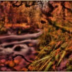
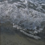

 I love the way this image almost looks natural when it’s flipped on it’s side. You can see a version of the picture flipped upright here. That same link also describes some of the techniques I used to manipulate the color in the image.